How I Made My Own Book Cover Using Microsoft Word
I joined the ranks of indie authors almost three years ago now, and I can’t begin to count the number of things I’ve had to learn in order to make it happen. I made quite a few mistakes with my first book, learned from them, and got better at writing, editing, formatting, marketing…the list goes on. I’m probably making new mistakes with my most recent release, Foundlings, and I’ll learn from those, too.
One thing I hadn’t thought about before abandoning the thorny path to traditional publishing was that I’d need to come up with my own book covers. With my first book, I used the Createspace cover designer program along with a public domain image and a little creative tweaking to get the job done. It was okay but clearly looked DIY. Some people said it was charming, which I’m not sure is what I was going for. For the covers that followed, I used the services of my friend Mark Walsh and was much happier with the results. For Foundlings, though, I knew Mark wasn’t going to have the time to do another cover within the time frame I was hoping for, so I was faced with a choice: seek out a new artist, or design my own.
I decided to give it a shot.
Let me say first of all that I’m not the most visually oriented. I don’t have a background in design. I’m a bit color blind. I only sometimes know when things look good and when they don’t, and when I do have an opinion I often can’t explain why. Still…I figured it couldn’t be that hard to find some stock photos, pay for them if I needed to, and put together a decent looking cover. I did a bit of research on DIY covers and found people who agreed that it wasn’t impossible to do a decent job, so off I went.
One blog post I found that offered some good practical advice was over at The Creative Penn. My version of Word is a little different than the one described there, but I was able to make it work. My biggest problem, and one which that post couldn’t help with, was deciding on an image or images to use. The post just suggests that you search a few recommended sites for photos or hire a photographer. Sounds good…there are a lot of images at public domain and stock photo sites, but how exactly to choose the best one? Did I want the cover to depict a moment from the novel? Or something else to capture the mood? And what exactly was the mood?
That one really stumped me, partly because Foundlings is such a departure for me. My previous books have either been science fiction or paranormal fantasies. This one is part historical novel and part contemporary with a bit of mystery and a bit of science fiction thrown in, one story from before and during World War II blended with another contemporary plot line with the two coming together somewhere in the middle. With all those elements at work, it was hard to nail down a central image or mood.
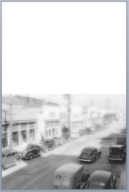
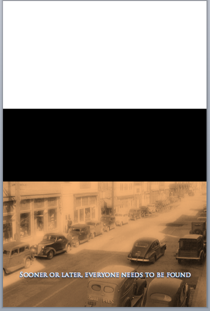
Part of the book takes place in a Japanese fishing village that used to be on Terminal Island in the Port of San Pedro, near Los Angeles. When Pearl Harbor was bombed and the American government turned a suspicious eye toward Japanese Americans and Japanese immigrants, the fishing village of Furusato was one of the first communities to be forcibly evacuated. While there are no scenes from the internment camps in the novel, the fate of the town and its residents reverberates throughout the novel. I thought the cover should do something to capture that feeling of loss.
I looked for and soon found a public domain photo of one of the streets in the town taken before the forced evacuation:
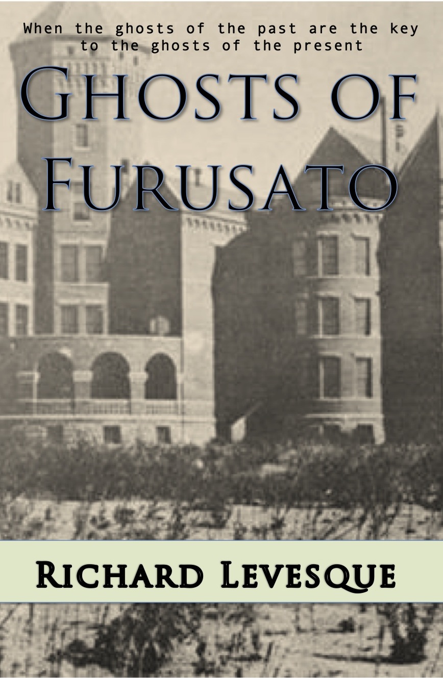
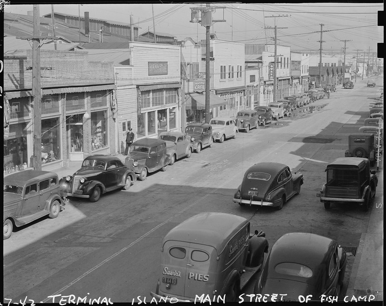 I liked the image. I felt it carried a sense of nostalgia. I decided to see about throwing in an image of barbed wire, hoping it would convey a sense of loss, maybe sadness or injustice. At the very least, I was hoping to inspire readers to wonder why there was barbed wire over the image of this street and then be compelled to look further at the book’s description.
I should also add here that the book’s title at the point was different: Ghosts of Furusato, playing off a ghostly motif in the book and the sense of loss conveyed in several of the scenes.
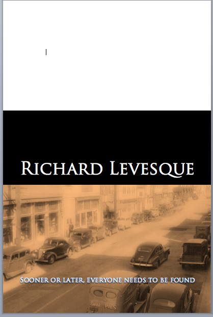
This, then, was my first attempt at a cover:

Okay, okay. I know. It’s terrible. The tag line is awful. The barbed wire looks out of place. The reflection on the lettering is distracting. The cover might convey something of the mood I was going for, but it does nothing to indicate what’s in the book. At the time, though, I thought it was pretty good (remember I said I don’t have a great sense of design?). I posted the cover to the Writer’s Discussion Group on Google+ and was told all those things and more.
Back to the drawing board.
At this point in the process, the smartest thing I could have done was break open the piggy bank and go to 99Designs. But I hesitated because my attempt at a cover had really opened my eyes to something: I just didn’t know what the cover should look like. Even at 99Designs it was going to be necessary for me to provide some direction for the competing artists, and I just didn’t have any.
So I did the second smartest thing I could–listened to good advice. Jefferson Smith at Creativity Hacker had been one of my beta readers, and I asked what he thought about the cover (by the way, if you don’t follow Jefferson’s Immerse or Die book reviews, you really should–a great source for indie science fiction, fantasy, and mystery novels as well as an eye-opening look at some indie fails for authors hoping not to repeat others’ mistakes). Jefferson’s first suggestion was that the book’s overall mood was one of sadness with a bit of menace, and he suggested a cover with a creepy building on it, based on another central location in the novel–the former California State Hospital at Camarillo, now converted into CSU Channel Islands.
So I started looking for images of creepy buildings online, old asylums, etc. I came up with a few and ran some by Jefferson. They weren’t much better than my first attempt. Here’s one:
 At this point, I should probably say a thing or two about formatting in Word to create a cover like this.
First, select your paper size. If you’re going to do a 6×9 paperback, set the paper size to 6×9. In my version of Word, that means going to File>Page Setup>Paper Size>Manage Custom Sizes. You may need to click the “+” button to add a custom size and then put in the dimensions you want.
 Once you hit “OK” you’ll have a blank document with the correct dimensions. The next thing I did was add the background photo I had found. When you do this, it may fill the whole screen, and may need to be enlarged. Double click the photo and grab one of the circles in the corners to enlarge the image.
You will need to choose how the photo is being included in the document. Remember that this is primarily a word processing document, so Word expects you to be using images with text. To manipulate the image, click the “Wrap Text” button and choose “Behind Text.” This will allow you to move the image and stretch it to fill your page.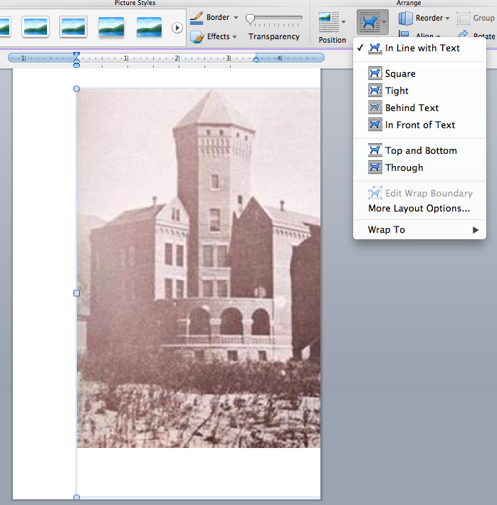 Once the image was in place, I added the title and tag line using text boxes. You can add shadows and other effects by clicking the Text Effects button (the large A in the toolbar). It’s a good idea to select the “Behind Text” option for the text boxes, too, so you can move them around easily. To add the solid block of color behind my name, I went to Insert>Shape on the toolbar, chose “Rectangle” and then put the rectangle in the space I wanted. When you do this, the default color may not be what you want, so you can change it:
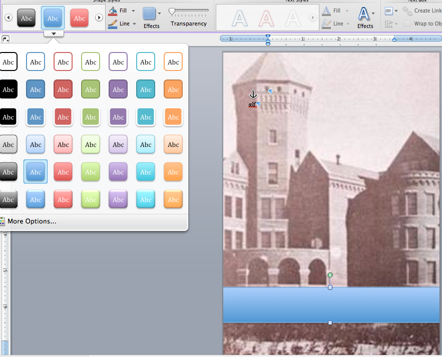
Once I had the color I wanted, I put another text box over the rectangle, added my name and then hit the “Recolor” button on the toolbar and to change the tone of the whole image.
I was happier with the results, but it still didn’t work with the book.
Then Jefferson gave me another great idea–look at the covers of other successful books in the same genre or those that capture the mood I’m after and do my best to imitate them; this is not to say “copy” them but rather try to use similar images, colors, fonts, and layout. We went back and forth a bit on the asylum idea and agreed that it might be setting more of a creepy mood than a sad one.
My next efforts involved graveyard angels. They’re sad, mournful. I Google-searched images of books with graveyard angels on the covers. For every hundred or so images of Neil Gaiman’s The Graveyard Book, I did find a few cemetery angels on covers and set about imitating them.
The results were…still not good. I won’t subject you to them. The thing is, even though they weren’t any good, creating them gave me a lot of practice with manipulating images and text. I also studied the covers I was trying to imitate and got a lot more ideas about things like fonts, font size, placement of text, etc.
And there was still one other major problem. All the cemetery angel images I was working with gave the cover a distinctly religious feel, and religious themes don’t come into the book at all. Furthermore, all the angels look clearly female; Jefferson asked if maybe the angels on the cover would make the book seem more targeted toward a female audience.
So angels were out.
It was Christmas Eve. I set the cover project aside and went on do to family things. Somewhere in the middle of dinner, I realized that the book wasn’t just about sadness or loss or mourning. It’s about things and people getting lost and then found. I toyed with “The Lost and the Found” and “Found and Lost” as titles. But I also had an idea for the cover image.
Not far from the site of the original Japanese village on Terminal Island, there is now a memorial to the village and its people. Some of the characters in the book visit the monument. Not only does it fit into the plot, but the statue also conveys a sense of loss. Still following Jefferson’s suggestion that I look at other covers for ideas, I noticed that a lot of historical novels used two images–one on top and another at the bottom with a strip in between displaying the author and title.
That was it. I had it.
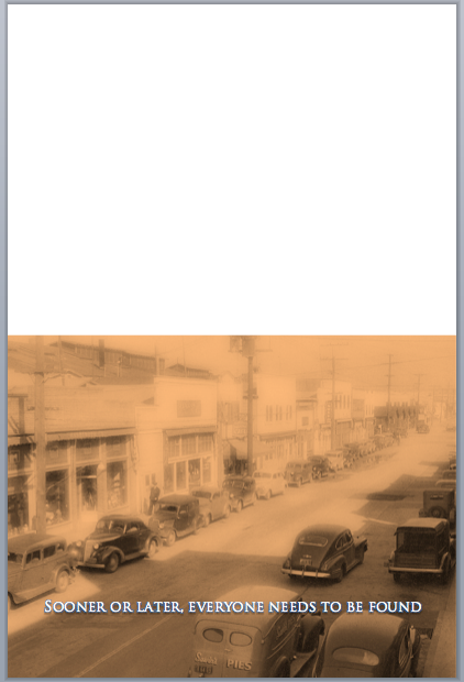
I did a few mock-ups and ran them by Jefferson Smith, Mark Walsh, and my wife (who also has a background in visual arts). Jefferson suggested my “Found and Lost” title might be a little too generic. He suggested “Foundlings” as well as the tag line: Sooner or Later, Everyone Needs to Be Found. It absolutely worked for me.
I needed a bit more help from another friend, Bill Chapman, who’s a local photographer, among other things. Since I couldn’t find any public domain or stock photo images of the statue, I needed someone who’s a better photograph than I am to capture the image on Terminal Island.
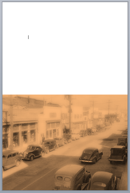
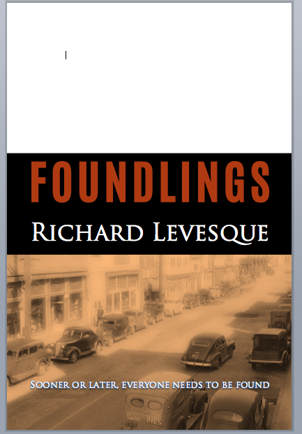
Using Microsoft Word, I set to work, using a 6×9 page size. I decided to start with my original 1940s photo of Terminal Island and then selected the image to recolor it.
Next, it was time to put in a text box with the tag line. Once I had it in place, I added a drop shadow to help the letters be more visible. I followed that with a rectangle, coloring it black. If you’re doing this kind of thing, remember to select the pictures, text boxes, and shapes and then click the “Wrap Text” button and click “Behind Text” to be able to move things around and place them as you want.
After that, I added two more text boxes for the author and title. I wanted fonts that would be different from each other; I also wanted different colors against the black background. Again, I made these choices after looking at a lot of other book covers that appealed to me.
If you find that one of your added elements disappears or drops in behind something else, you can use the “Reorder” button next to the “Wrap Text” button. Try sending different elements to the back until you get the look you’re going for.
Finally, it was time to add Bill’s photo, and then the cover was complete:
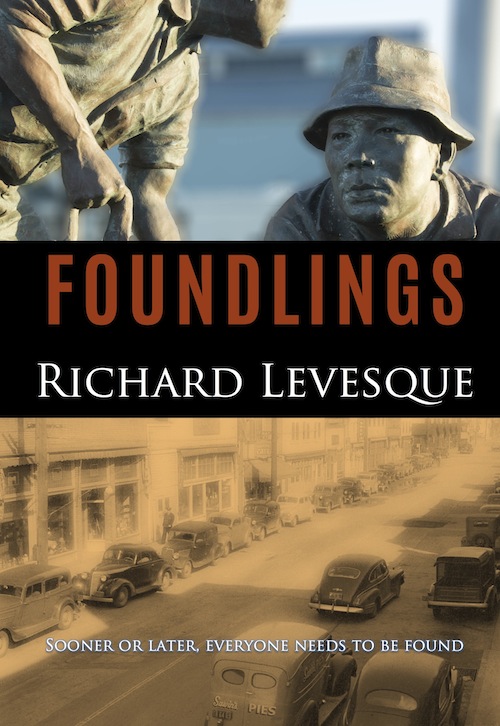 I’m very pleased with the way it came out. The two images contrast nicely with each other and work to convey a sense of sadness and hope at the same time. There’s longing here but also potential.
One thing that Jefferson Smith told me that really stuck in my mind throughout the process was that “Cover art is a poem, not an essay.” I needed to capture the mood, to be evocative, to use visual metaphor to convey the feeling of the story and make it look compelling. I think I succeeded after a lot of false starts, but I needed to make those mistakes in order to learn from them.
The learning curve goes on. I hope this has been helpful to anyone thinking of designing his or her own cover. If you’d like to have a look at the book, it’s currently in pre-order status–with a discounted pre-order price!


99designs Cover Design Foundlings Furusato Immerse or Die indie publishing Japanese Internment Jefferson Smith Microsoft Word Neil Gaiman San Pedro Terminal Island The Creative Penn The Graveyard Book Writer's Discussion Group


One Response
[…] research, drafting, revising, working with beta readers, revising some more, proofreading, editing, cover design, marketing, blogging, posting, elevator-pitching, and so on have all come together, and now the […]
Comments are closed.