My Experience with a 99designs Book Cover Contest
When I released my cyberpunk dystopia Strictly Analog in 2012, I used a cover designed by a friend with a lot of experience in graphic arts. The book is a near-future noir-style mystery about a private detective who’s locked out of the high tech world he inhabits because of physical disabilities. As such, he exists on the fringes of society and can a lot of shady work done without being noticed by all the other people who are constantly wired into the grid.
My original concept was to do a cover using some form of antiquated technology, and I came upon a public domain image of a rotary telephone which I then took a shot at building a cover around. I had done a DIY cover for my first book, Take Back Tomorrow, earlier that year and then had gone to my friend Mark Walsh for help with my first Ace Stubble novella, Dead Man’s Hand
, as the demands for that cover concept were way beyond my abilities. Mark was deeply involved in another project when I was finishing Strictly Analog
, so I worked up my own cover and ran it past him. He was intrigued, and my cover was just bad enough for him to put the brakes on his other project and jump in to render a beautiful 3D image that took my original idea to new heights. The resulting cover was beautiful:
 The reflections, the scratches, the detail…I still think it’s a great cover, and it served me well. I’m extremely grateful to Mark for putting this together for me.
I kept the cover for two years. And then realized (after picking up some constructive criticism) that the cover definitely said noir and maybe even hard-boiled mystery, but it didn’t say science fiction or cyberpunk or dystopia. And that was a problem.
For readers who see my book in an Amazon list of “Customers Who Bought ___________ Also Bought,” the cover and star ratings are about the only thing that would prompt someone to click on Strictly Analog instead of the book next to it. The person looking for hard-boiled mystery might be curious, but the person going for cyberpunk might see a rotary phone, beautifully rendered or not, and just keep going.
I needed a new cover. And the time had come to go outside my comfort zone. On the recommendation of a friend, I turned to 99designs.com.
What followed was a pretty simple process. I chose a payment threshold, more than I’ve spent in the past but not as much money as I could have. The payment options at 99designs run from $299 to over $1000, the idea being that the more one is willing to spend, the more one will attract high end, professional designers.
The way it works is customers (anyone looking for a logo, a book cover, or some other design) set up contests with the criteria they are looking for. Interested designers respond with their ideas and the contest owner rates the entries. After a week, the contest owner decides on a few entrants to move forward to the final round. If you don’t like any of the designs, you don’t have to select a winner, and the people at 99designs seemed particularly interested in making sure I was happy with my choices.
It didn’t take long for designs to start coming in; some looked great and some not so much, but they were all interesting. I had put together a rough idea of what I wanted–a man in silhouette with some computer code around him–and many of the designers jumped on that idea and produced interesting variations. I noticed that a lot of the designers used stock imagery (which they are supposed to let you know about up front), and somewhere along the way there began to be this glut of hooded figures in the cover designs. I rejected these, as the story isn’t about a ticked off monk but a down and out detective in a near-future Los Angeles.
After a week, I narrowed the field down to two designers, gave them some critiques of their designs and explained what I wanted to see changed. A few days later, I had my winner. He got paid, and I got my cover.
Here’s the result:
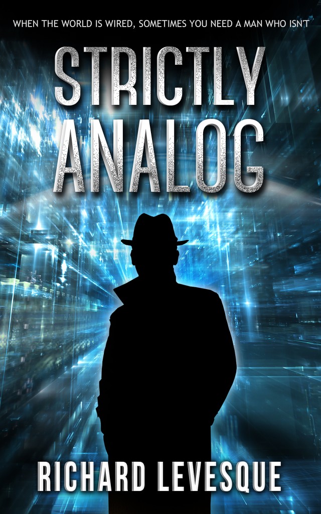
I’m happy with the way it turned out. I still think the original phone cover was very cool. I guess the (few) paperbacks that sold during those two years are collectors’ items now.
Overall, the process at 99designs was easy and satisfying, and I would recommend it for indie authors. We’ll see now if the new cover speaks more clearly to the cyberpunk audience. What do you think of it?


99designs Book Covers cyberpunk Dead Man's Hand dystopia hard-boiled mystery Science Fiction Strictly Analog Take Back Tomorrow


6 Responses
First, I love Strictly Analog, as well as Take Back Tomorrow. I also loved the phone cover for Strictly Analog. The cover was a visual pun of sorts, but it was also quite representational, rather than straightforward. The new cover is much more straightforward and the tag line at the top also clues you in about the story. From a purely artistic, literary standpoint, I still love the phone cover. From a marketing standpoint, the second cover makes more sense and may pull more readers between the covers by communicating more clearly.
Thanks, Steve. And thanks for reading my books! I think you’re right–it’s art vs. commerce. Sadly, art usually loses out.
The more I look at the new cover, the more I see that it works very well. Not only does it say Noir and Tech, but it also has a Dr. Who feel to it! As much as I like the older cover, it only told part of the story.
I really enjoyed collaborating on the first “dial” cover and was happy with the image itself. It is eye catching and I imagined readers stopping to pull it off a shelf in a bookstore out of curiosity. When I heard the critique of the cover from pros I agreed completely about making more of an effort to sell the story with overt cues about the content. That is the job of the cover. We got closer to achieving that goal with Walk A Mile, The Girl at the End of the World and Dead Man’s Hand. I wish I had the time to work on the new one, and make a fully rendered original painting, because the directive has so much potential. I think the end result on the new cover will definitely do a better job selling the story and conveying the content to potential readers. Good job.
Thanks, Mark. I agree the others come in a lot closer to capturing the “essence” of the stories. I still miss that phone, though…Kill your darlings, right?
[…] point in the process, the smartest thing I could have done was break open the piggy bank and go to 99Designs. But I hesitated because my attempt at a cover had really opened my eyes to something: I just […]
Comments are closed.